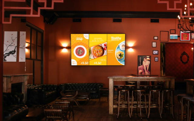
Designing eye-catching digital signage content requires a delicate balance of visual appeal, functionality, and clarity. While this may seem intimidating at first, there are a number of best practices that you can keep in mind to ensure that your digital signage installation captivates your target audience. In this article we will examine 7 of the most important best practices for digital signage content, along with some important examples of how they work.

1. Keep Your Message Simple and Clear
Have you have ever heard the common phrase “less is more”? Well it applies to digital signage content as well! Decide on the key message for your digital signage, or its intended purpose, and then ensure that your content is designed with this message/purpose in mind. Remember, in most cases your audience may only glance at your digital displays for a few seconds, so it is extremely important that your key message is quickly and easily understandable.
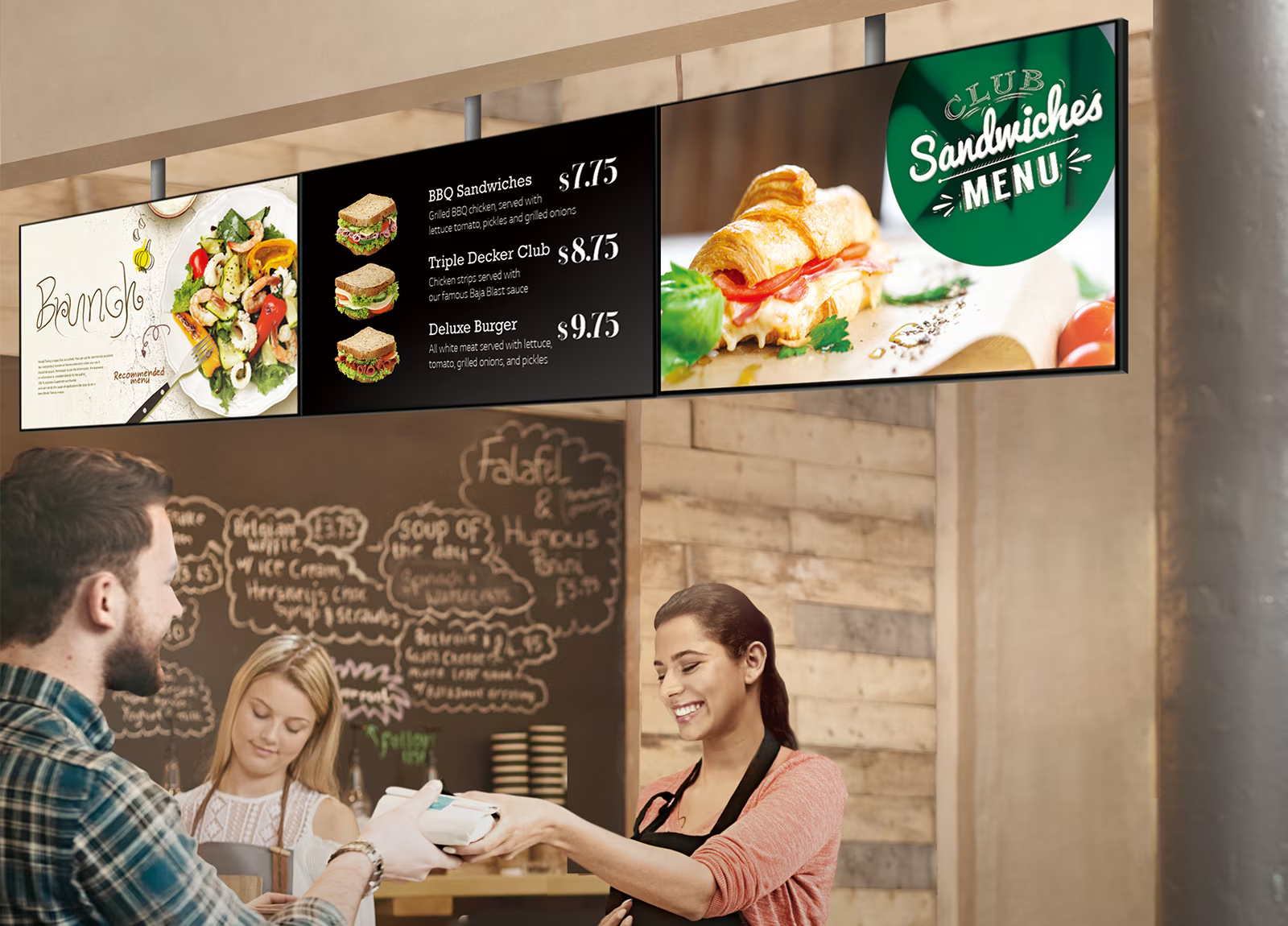
If your digital signage features multiple display zones, then it is also okay to designate a different message for each section, but be sure not to go overboard. For example, a digital menu board might have a section focused on current promotions or LTOs (long-term offers), yet have the rest of their menu board focused on upselling combo meals. In this case while the two messages are functionally different, the restaurant has narrowed its focused and not tried to include too many competing messages.
Pro tip: If applicable, be sure to include a relevant call to action in your content such as “Upgrade to a Combo for $4.99” or “Ask about our daily special”. By telling your audience what you would like them to do, it makes it much easier for your message to have its desired effect.
2. Prioritize Readability
Just as with any other type of design, readability starts with your choices of font and colour. When deciding on your fonts and colours it is of course best to take your branding into account, however it is equally as important to ensure that your digital signage is easily readable.
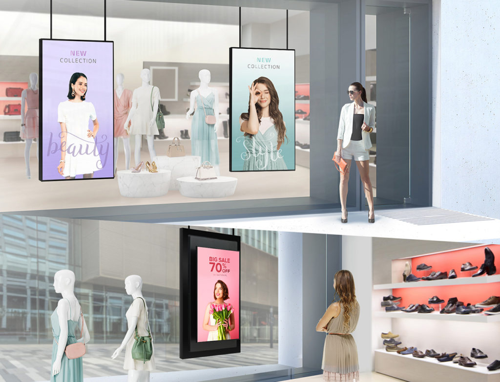
When picking your fonts try and narrow your selections to no more than two different fonts – typically designers will choose one font for the headings and one font for the body, or use two different weights of the same font. Avoid overly fancy or decorative fonts in your content, and instead opt for bold sans-serif fonts like Aerial or Helvetica as they are more readable at a distance. In the above photo, the first LED posters utilize a script font for a single word to maximize impact, and use a more readable font for the main message they want to get across.
When deciding on a colour scheme, however, best practices favour contrast above all else. This means that if you have chosen a darker colour for your background, then you should instead opt for a lighter text to ensure that it properly stand out. The harder your viewer has to work to understand your message, the less chance it has of getting across the way that you want it to – if at all.

3. Use High-Quality Visuals
Be sure to utilize high-resolution images and videos in your digital signage content to avoid pixilation, especially if you are using large commercial grade screens. Blurry or low-quality images and video can easily appear pixilated and can ultimately detract from the professionalism of your digital signage displays. Even one blurry low-quality image can reverse the brand trust and professionalism that you have built up with the rest of your marketing efforts.
Additionally, images should be used strategically. While there are more image-focused digital signage designs and more text focused designs, it is important to not clutter your signage with unnecessary elements.

4. Incorporate Motion and Animation Wisely
Dynamic elements such as videos and animations can add some much needed motion to any design, however, as with any good thing they must be used sparingly. Subtle animations such as steam above a coffee cup or a rotating graphic can be used to draw attention without overwhelming the viewer. If every piece of your design moved, then not only would it be overwhelming, but it would also be very hard to focus on any individual element. In short, use animations and videos to guide your viewer through your digital signage and create visual movement, but be sure not to overdo it.
5. Maintain Brand Consistency
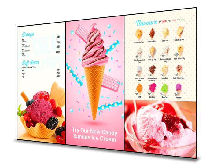
When somebody looks at your digital signage installation, they should be able to recognize your brand almost instantly. From branding colours and fonts, to logos and branded graphics, and even style consistency, ensuring your content matches your brand is key. While it is important to maintain brand consistency, it is also equally as important to keep point #2 in mind and make sure your content is easily readable. If you have multiple colours and fonts to use, try picking a selection of them that compliment each other yet still push your brand identity; this also helps your content look more cohesive, and fit better in your branded space.

6. Use Effective Color Schemes
While this point may seem similar to #2 “Prioritize Readability”, an effective colour scheme takes many other factors into account. As we have previously mentioned, selecting contrasting colours ensures that your text and content will stand out, but it can also help strategically draw the attention of viewers. Colours such as orange or red for example are excellent choice if you want a specific element to stand out and demand attention.
Another element we recommend keeping in mind when selecting the colours for your digital signage is the types of emotions that you want to evoke. Just as colours can draw attention, so too can they evoke emotions in the viewer – for example, red for urgency, blue for calm, and green for nature of health. These elements are a part of colour theory, and have likely been taken into account by your designer when developing your branding package/logo, but they are still important to keep in mind nevertheless.
7. Test and Measure Effectiveness
For brands that really want to take advantage of their digital signage and maximize their ROI, we recommend experimenting and utilizing A/B testing. To effectively A/B test you first need to establish performance metrics – for this example, we will use “combos sold” as our performance metric. If a restaurant is trying to sell a new combo or meal, they can deploy different versions of their promotional content (colour schemes, messaging, layout, etc) and then track their “combos sold” metric to see which performed better. While this may not seem as effective initially, the more data you collect the better; once you collect your data, refine your content based on your finds and experiment some more.

8. Optimize for Viewing Distance and Environment
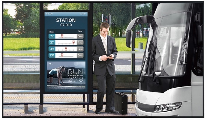
The placement of your digital signage screens matters a lot more than you might expect. Not only does the distance to your viewer impact your text size and font choices, but it can also determine the type of screen you want to use. For example, if your installation is outdoors or facing a bright window, you might want to use a high haze commercial grade screen to ensure proper visibility. Outdoor displays also typically require a higher brightness setting, larger text, and brighter colours due to natural light interference.
In Conclusion
In conclusion, while designing your digital signage content can be a little intimidating, there are a number of best practices that make the task far easier. From effective colour schemes, to optimized viewing distance, and even perfect readability, each of these tips can help take your installation to the next level.
Related Posts

Sustainable Solutions: How Digital Signage Helps American Businesses Go Green
As sustainability becomes an increasing priority for modern American businesses, many business owners are looking for innovative ways to reduce their carbon footprint and adopt eco-friendly practices. Digital signage offers a compelling

Adapting Digital Signage for Seasonal Campaigns and Holiday Promotions
The holidays are fast approaching, which means many businesses are gearing up for their holiday marketing campaigns, promotions, and initiatives. There are many ways to use digital signage for holiday

5 Ways to Use Outdoor Digital Signage
Outdoor digital signage has become extremely popular in recent years and for a very good reason. This incredible technology has seen numerous advancements that allow it to be a staple
The Future of Outdoor Digital Signage: Weatherproof Displays and Sustainability
The future of outdoor digital signage is increasingly shaped by two key trends: the need for weatherproof displays and the drive toward sustainability. These trends are driven by technological advances,

